Graphs
 Production | Graphs
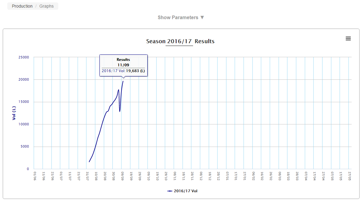
Graphs are used to illustrate the various results of production for a product within a date period. This function also allows the direct comparison of previous production cycles against the current season to be viewed.
- Ensure you have the correct product selected for populating graph data.
- To open the selection criteria and generate result data, click on the
 icon beside Show Parameters.
- Using the parameters shown above, select a season date from the Season end parameters. The parameter option will turn green to represent the selected field. Clicking on a selected field will deselect it.
- Select the test option from the Tests parameter list. Up to 4 tests can be selected for display on the graph at a time. The tests available for selection are determined by what has been set up by your vendor. The parameter option will turn green to represent the selected field. Clicking on a selected field will deselect it.
- Select the Plot by option. The graph data can be viewed by Day, Period or Month.
- The normalise skipped day check box can be selected for when skip a day milkings are in effect. Ticking this option smooths out the graph that would otherwise show big variations.
- Click the Apply button and the graph will be generated.
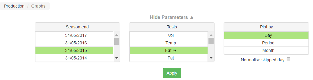
Note: The Plot by field will update the graph immediately when an option has been selected without the requirement to click the apply button.

The graph above shows the Daily Fat Percentage results of Milk for the 2014/15 Season. Running the mouse over the data in the graph displays result summaries.
- Ensure you have the correct product selected for populating graph data.
- To open the selection criteria and generate result data, click on the icon beside Show Parameters.
- Using the parameters shown above, select the two season dates for comparison from the Season end parameters. Two season end dates are the maximum number of dates that can be selected at a time. The parameter option will turn green to represent the selected field.
- Select the test option from the Tests parameter list. Up to 4 tests can be selected for display on the graph at a time. The tests available for selection are determined by what has been set up by the Madcap Administrator. The parameter option will turn green to represent the selected field.
- Select the Plot by option. The graph data can be viewed by Day, Period or Month.
- The normalise skipped day check box can be selected for when skip a day milkings are in effect. Ticking this option smooths out the graph that would otherwise show big variations.
- Click the Apply button and the graph will be generated.
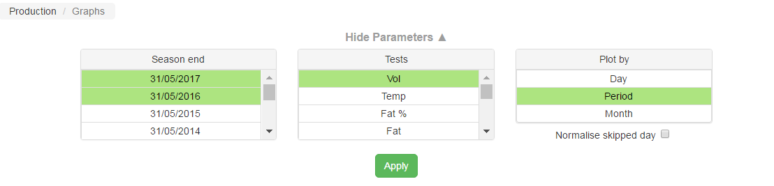
Note: The Plot by field will update the graph immediately when an option has been selected without the requirement to click the apply button.

The above graph shows the Volume results for the 2015/16 and 2016/17 season for each period. Running the mouse over the data in the graph displays result summaries.
The graph can be printed or the image saved by clicking on the  icon located on the right side of the graph heading and selecting an image format selected from the options below.
![]()

|